
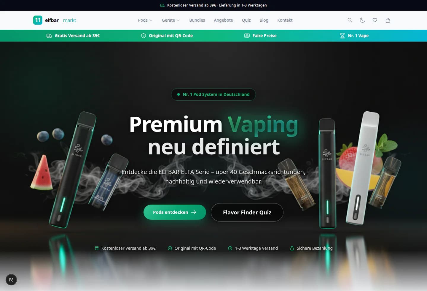
 Interactive design preview
elfbarmarkt — VapeN project preview
A neutral exploration of the source project's dark storefront composition, image-led category rhythm, and emerald interface signals.
Explore the designEcommerce website design connects product collections, detailed product pages and clear shopping journeys to help customers explore your store and buy.
Product clarity. Distinctive design. Connected experiences.A store needs more than a product grid. Shoppers need to understand the range, compare relevant differences, and inspect the information and policies behind a purchase. We plan collection and product layouts together, then review selection controls, navigation, mobile use, and the path to the next step. Catalog preparation, checkout integrations, payment services, and platform responsibilities are defined explicitly in the project scope.
Compare the wider approach in our website design services overview. For a more specific need, explore Ecommerce SEO or Shopify SEO.
Open two project previews and explore their layouts, visual details, and navigation for yourself.
Interactive design previewA neutral exploration of the source project's dark storefront composition, image-led category rhythm, and emerald interface signals.
Explore the design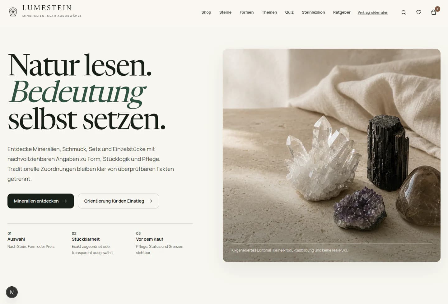 Interactive design preview
An editorial catalog direction built around paper-like surfaces, mineral imagery, clear distinctions, and calm discovery paths.
Explore the designDemonstration previews. No purchases or messages are processed.
A useful store connects discovery, product detail, and a clear next step.
Help visitors make sense of the range before asking them to choose.
Bring images, options, and practical information together.

Make the next step clear and keep the interface consistent.
Follow an illustrative store journey built around everyday desk objects.
Quiet tools for the small things that shape a working day.
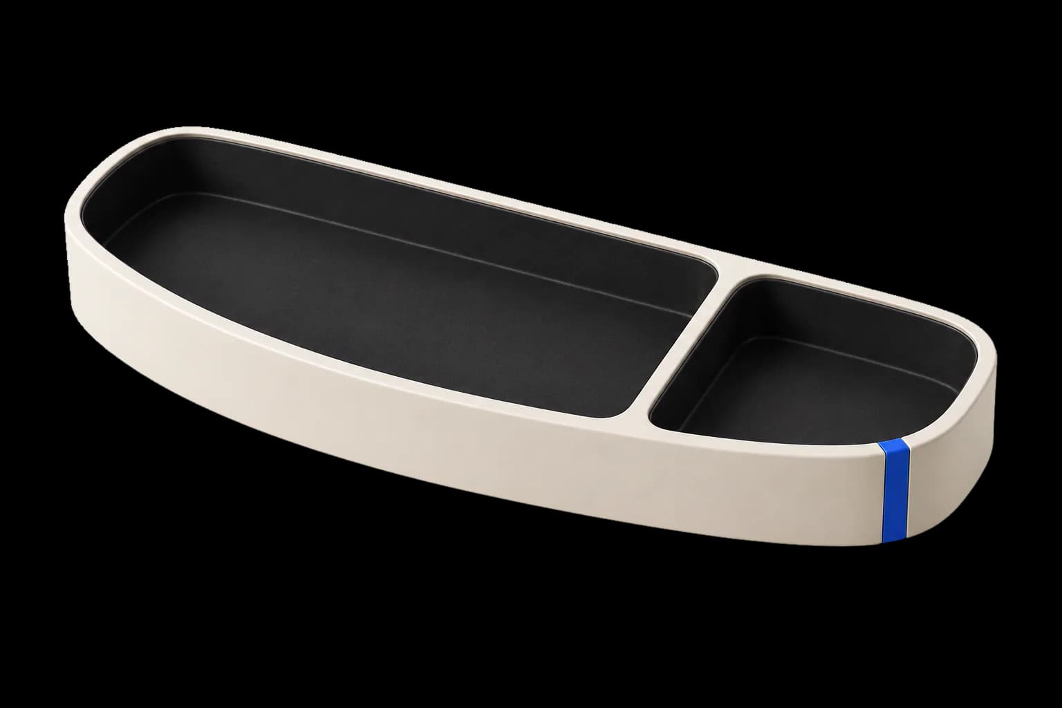

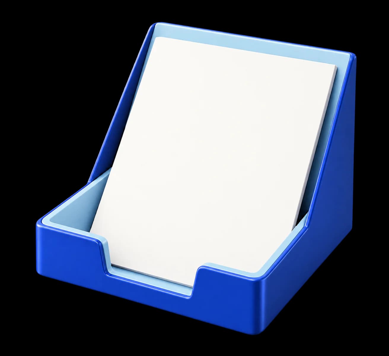
Quiet tools for the small things that shape a working day.
A simple place for the small things you reach for every day.
This example does not process orders.
Discuss a store like thisStructure, product information, interaction, and implementation should support the same journey.
Give collections, categories, and product discovery a structure that fits the range.
Combine imagery, options, and practical information in a clear, responsive layout.
Make typography, imagery, movement, and interface feedback feel like parts of the same store.
Build the agreed experience, review key journeys, and clarify the platform, editing, and ongoing responsibilities.
Platform, data import, payments, shipping, tax, content, and third-party integrations are confirmed in the project scope rather than assumed.
The store should make the range feel coherent and the important details easy to find. Give the products room while keeping the experience clear.
Defined page types, navigation, and the role of the main collections.
A consistent direction for product imagery, interface elements, and mobile layouts.
Clear requirements for the platform, interactions, integrations, and handover.
Understand the products, available content, audiences, and operational requirements.
Develop the visual direction, page types, and interactions around the agreed scope.
Check the experience and confirm what is needed for launch and ongoing ownership.
Use these answers to define the experience, platform, and responsibilities before implementation begins.
The work can cover store structure, collection and product layouts, visual design, responsive behavior, and agreed implementation requirements. Platform features and integrations need to be confirmed in the project scope.
A closer look SEO Supreme
Ecommerce website design should help a visitor understand an item, choose an appropriate option, and see the conditions of purchase. Visual polish matters, but the product page must also explain the details that a photograph alone cannot answer.
Dimensions, materials, compatibility, care, or delivery details can change the decision. Identify the fields that apply to your range and make them consistent enough to compare. A product with several technical options needs a different layout from a simple gift item.
Connect option labels, relevant images, availability, and the selected item clearly. Avoid ambiguous names that require a shopper to infer what a choice means. If product data is incomplete, resolve it before using a new design to make an uncertain offer look finished.
Make delivery, returns, and applicable restrictions easy to find when they become relevant. The actual terms must come from the business. A concept design can illustrate where that information belongs, but it should not invent a policy or imply that a checkout integration is already connected.
A useful category structure reflects how customers recognize and compare the range. Gather the product attributes that support those choices before designing menus or filters. Dimensions, material, compatibility, capacity, or intended use may matter more than the internal name of a supplier group. Keep labels and units consistent so a shopper can interpret the choices without guessing.
Test the structure with representative products, including exceptions. A filter is only useful when the underlying records contain reliable values. If the same measurement appears in different units or a field is mostly empty, resolve the data requirement before presenting it as a confident comparison. Decide who maintains those fields when new products are added.

A simple product can make a proposed layout look complete while leaving important requirements undiscovered. Select an item with a meaningful combination of options, specifications, images, and purchase conditions. Identify which facts a shopper needs to understand before selecting it. Use confirmed product information so the business can review a realistic page instead of a decorative placeholder.
For a fictional lighting store, a desk lamp might need verified dimensions, finish choices, power requirements, included parts, and care information. Images can show scale and finish, while text explains details that a picture cannot establish. Avoid inferring compatibility or included accessories from appearance. This example defines a design question; the actual product facts must come from the merchant.
A shopper should be able to tell which item is selected and whether that combination can be ordered. Keep option names, relevant images, availability, quantity, and the main action connected. If a choice changes the item or price, make the result understandable before the shopper proceeds. Include realistic labels rather than testing only unusually short sample text.
Review what happens when an option is unavailable or a selection is incomplete. Explain the state and offer a supported next step where appropriate. A hidden or unexplained disabled button can leave someone uncertain about how to continue. Test that the selected item remains consistent through the cart and checkout, including when a shopper returns to edit the choice.
Purchase conditions should be available where they affect the decision. Identify the merchant’s actual delivery areas, shipping options, pickup rules, and other relevant restrictions. Use those confirmed terms in the layout and explain when a final cost can be calculated. Avoid filling a design with assumed delivery promises or return policies that the business has not approved.
Test representative addresses and order combinations through the supported checkout process. Include an address outside the available area, an unavailable shipping method, and a discount that does not apply. The messages should tell the shopper what happened and what they can change. Check that the final summary represents the selected items and the actual amounts the customer is being asked to approve.
A store can draw product information, availability, prices, and order updates from several systems. Identify which system owns each record and which direction the information moves. Include timing and exception handling in the requirements. A visually correct product page cannot establish that its stock value agrees with the team fulfilling the order.
Review the operational journey with the people who use it. Where does a new order appear? How does an availability correction reach the storefront? Who investigates a failed update? Agree on those answers before treating an integration as complete. Give the receiving team documentation and the appropriate access for the actual setup, rather than requiring them to infer the workflow from a finished interface.
Before launch, use an agreed test method to check discovery, selection, cart changes, checkout feedback, and the resulting order record. Include phone-sized screens and relevant keyboard interactions. Review the confirmation against the actual order state. An analytics purchase event is a measurement record; it should be checked against the business system rather than assumed to prove a successfully received order.
Also ask the merchant to perform a routine update, such as changing a product image, attribute, or availability value. The editing experience is part of the store’s usefulness after handover. Keep ongoing care and optimization responsibilities clear. Later improvements should follow observed customer questions and operational problems, with completed design work distinguished from commercial outcomes still being measured.
Tell us about the range, the experience you want to create, and the setup you need the store to work with.
Explore website design